Crypto Heatmap: Cryptocurrency prices visualization
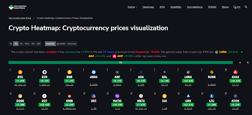
The crypto market dropped by -1.46% in the last 24 hours. Compared to the previous period, it has dropped by -0.41%. Today's top gainers from crypto top #100 are ![]() DEXE +22.98%,
DEXE +22.98%, ![]() BEAT +18.02%, and
BEAT +18.02%, and ![]() JTO +6.35%, while today's top losers are
JTO +6.35%, while today's top losers are ![]() PI-11.90%,
PI-11.90%, ![]() ARB-8.83%, and
ARB-8.83%, and ![]() STX-7.41%.
STX-7.41%.
Cryptocurrency Heatmap: What it is and how it works
Cryptocurrency heatmaps are handy tools to see at a glance what's going on in the crypto market.
This article aims to show you how cryptocurrency market heatmaps work and get helpful info from them.
What is a crypto heatmap?
Cryptocurrency heatmaps can be of different types, but usually, they take into account crypto prices and volatility.
You will see differences in cryptocurrency prices considering a specific timeframe to understand it better.
The heatmap automatically records all changes collecting data from top exchanges to be constantly updated and giving you the correct info at the right time.
You can see several cryptocurrencies. In this case, their positions depend on market capitalization — so Bitcoin is the first one. The timeframe is one day by default, but you can change it.
To give you a practical example: Bitcoin's price is currently $62,982, and it changed by -1.90% in the last 24 hours. Thanks to the heatmap, you can easily visualize the heatmap for the other cryptocurrencies.
This info is beneficial, especially in two cases:
- When you already have crypto assets in your portfolios, and you want to see how they perform checking only one platform;
- When evaluating a new trade or investment, you want to check market developments.
But not all crypto heatmaps are equal.
Let's consider the difference between the cryptocurrency market heatmap by CoinMarketCap and Top Crypto Coin Price:
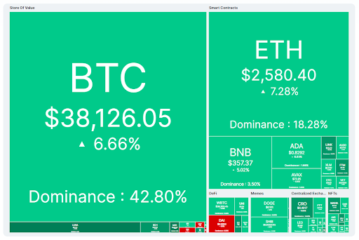
On CoinMarketCap, the size of each window is different depending on asset dominance — that is, the higher the share of the market owned by that specific coin or token, the larger the window.
Only the last 24 hours it takes into account: if the price of that crypto increases, the window will be green; if it decreases, the window will be red.
Even if it's still a helpful way to represent market variations visually, it can be hard to consult altcoins different from Ethereum — not all traders have only the top 2 cryptos in their portfolios.
That's why Top Crypto Coin Price thought of a different solution.
How to easily visualize the info you need with Top Crypto Coin Price heatmap?
Considering the functioning of the Top Crypto Coin Price heatmap will help us provide you with a real example of how a cryptocurrency market heatmap works.
This heatmap tells you more than what is usually shared with the reader, so let's see the different features of this platform.
#1 Choose
This heatmap allows you to choose among different types of data and different timeframes. Let's see these features in more detail.
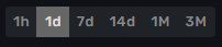
Top Crypto Coin Price heatmap allows you to see not only daily data. You can choose among:
- 1 hour;
- One day;
- One week;
- Two weeks;
- One month;
- Three months.
So, if you choose the monthly time frame for Ethereum, you'll get:
- Price change: +7.43%;
- Current price: $1,788.06.
The timeframe you choose will also influence the type of data you select.
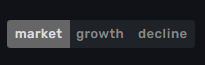
- Market: if you choose this option, you will see a heatmap where cryptocurrencies are ordered by market capitalization.
- Growth: this option will show you a heatmap ordered by price increase — the crypto that experienced a higher increase in price will be the first.
- Decline: the asset that experienced a higher decline will be the first.
#2 Recap
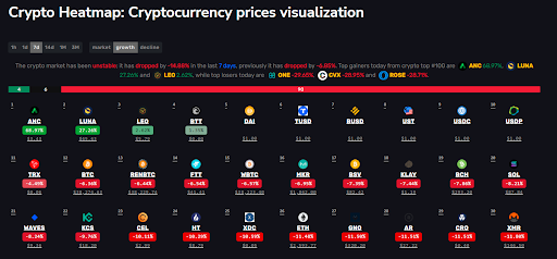
This crypto price heatmap starts with a recap of market developments — always according to the timeframe ad data you select.
In the image below, data are collected considering the current weekly growth:
The recap tells you that during the last week, the market was unstable, and the percentage of its decline is indicated. Moreover, you can see at glance top losers and winners.
There is also a colored bar:
- The red part shows you the number of digital currencies and tokens that experienced a decline — in this example, 90 out of 100. Top Crypto Coin Price heatmap shows you the top 100 cryptocurrencies.
- The black part represents the number of stable cryptocurrencies — usually, this is a characteristic of stablecoins.
- The green part shows you the number of assets whose price increased — in our example, 4 out of 100 in the last week.
#3 Crypto Heatmap and extended data
According to the option you selected, you will see a different heatmap, but each window will always have the same size, so it will be easier to check all coins and tokens.
Each window will show you:
- Ticker and logo;
- Rise or decline — and relative percentage;
- Current price.
Each crypto is colored according to its changes in price — green if the change is positive, red if the asset experienced a decline, black if it was stable.
If you want to know more, you can — try to click on a window:
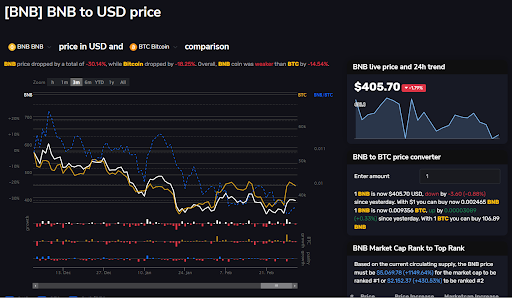
For our example, we clicked on BNB. For each coin, Top Crypto Coin Price will give you info related to:
- Ticker, the complete name of the crypto and price in USD or BTC;
- How the asset developed and a comparison with Bitcoin;
- Chart — you can choose different timeframes and even decide to see three separate lines on the same graph: the one that represents the selected you selected, the line related to Bitcoin, and the price of your crypto in BTC;
- An evaluation of your profits if you had invested in that digital coin;
- A price converter;
- The price needed by the crypto to reach the first positions in terms of market capitalization;
- The ATH of that crypto and its price history;
- The price of that crypto converted to the top 10 cryptos;
- Daily volatility.
Cryptocurrency heatmaps are helpful if you want to see crypto price changes very easy to make quick and informative decisions.
But we don't just provide you with a crypto heatmap but a platform to give you any data needed by crypto traders and investors.
Updated